Preliminary post
In my article for Seeking Alpha, I outline all the fallacies of a recent report by Global Equities that called for the firing of Apple CEO Tim Cook. Virtually every point they made was at best forced, and at worst totally false.
One point that I make is that is is extremely contrived for them to take Apple’s Sept. 2012 high of $702 as the starting point for all analysis. Here I present several charts that illustrate my point. (I feel that these would encumber the SA article that had several other points to make.)
——–
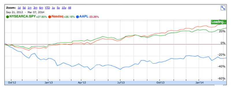
This is Global Equity’s chart showing 23% fall from 2012 high. But there are several other starting points that make just as much sense. It is very contrived to insist on this as the only one from which to calculate Cook’s “destruction of shareholder value.” According to the report, Cook and Oppenheimer solely responsible responsible for the decline. (I address other issues in my SA article.)
——–
Cook’s first day
One very reasonable date to select as a starting point would be the day Cook officially took office as CEO. From Sept. 12, 2011, Apple’s performance shows a different picture. While it still lags the NASDAQ and the S&P, a 40% rise is not so bad. One could make a good argument that this is indeed a much better judge of his performance.

——–
Dear friends – if you appreciate my commentary please consider viewing my product linked below.
Elegant, Handcrafted, Genuine Leather
iPhone Holster

——–
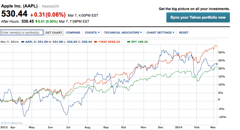
Or how about the last twelve months? This is a common time frame.
Here, up 23%, Apple has not performed that badly at all. It still lags the NASDAQ, but beats the S&P.
——–
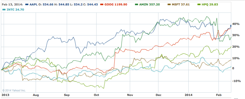
Competitors
Here we see it against some competitors over past 12 months. Not particularly good, but should an investor complain about a 23% rise, especially with a large dividend?
——–
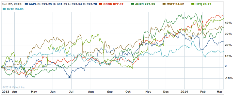
Recent low
In this final chart we look at performance from the low point on June 27, 2013. Since then, Apple has actually led the whole pack, beating even Google with about 38% rise in value!
And why not pick the low point? You may argue that this price is contrived, but is it any more contrived than Global Equity’s picking the high point?
——–
Caveat Emptor!
My point is simply this.
Charts are very helpful to illustrate a point, and there is nothing inherently wrong in selecting a particular chart to illustrate your point. That is what they are for.
The reader, however, needs to look at a chart and decide for him- or herself
- if that chart is a valid representation of reality, or
- if it is selected solely on the basis of fitting the argument.
——–
Your comments are appreciated!
Our Sponsor:
Elegant, Handcrafted, Genuine Leather
iPhone Holster

——–
——–